
Yes, I have processed all your feedback and reached a decision. But before I show you my final version; I want to say a big thank you to everyone who chimed in on which cover you prefer. I got over 100 comments on my various channels, that’s a lot of feedback to process! And boy did your feedback set my mind in motion! My head was spinning all Sunday evening, in fact, it took a while to fall asleep since I was processing all the input and trying to make a decision.
So let’s take a look at your feedback:
Your preference
- Cover 2 got the most votes
- Then came cover 1, with 3 not far behind.
Your feedback (a summary)

Cover 1. Clean, modern and joyful. Will look good as a small thumbnail (which is important as I will sell the book on Amazon). But a little too much magazine/lifestyle.

Cover 2. Great diversity and gives a good idea of what the content will be. A classic DIY book design, you know what you will get, it’s clear it is a sewing book and not a lifestyle book. However, it will look busy in small-scale, possibly more suited for the back cover.

Cover 3. Clean and fresh. Catches the eye. Best photo. Will look good as a small thumbnail. But the cover lacks diversity and is a bit too much like a fitness/lifestyle cover.
So what did I end up with?
Well on Monday afternoon I had reached some clarity. So after work, I sat down with a Deep Focus playlist on Spotify and cranked out this…
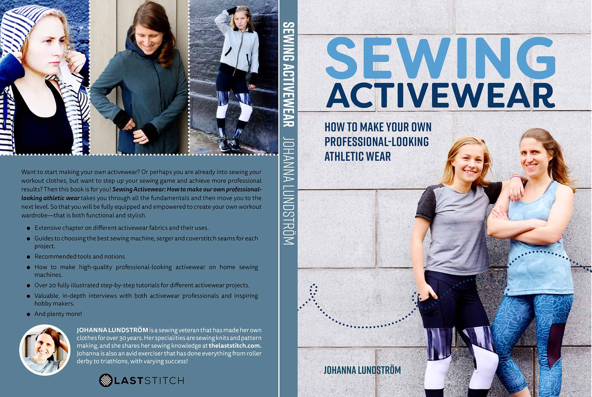
Yes, it is an updated version of cover nr 1 and with the back cover being inspired by cover number 2. Sorry in advance if there are some typos, I have not proofread the cover yet!
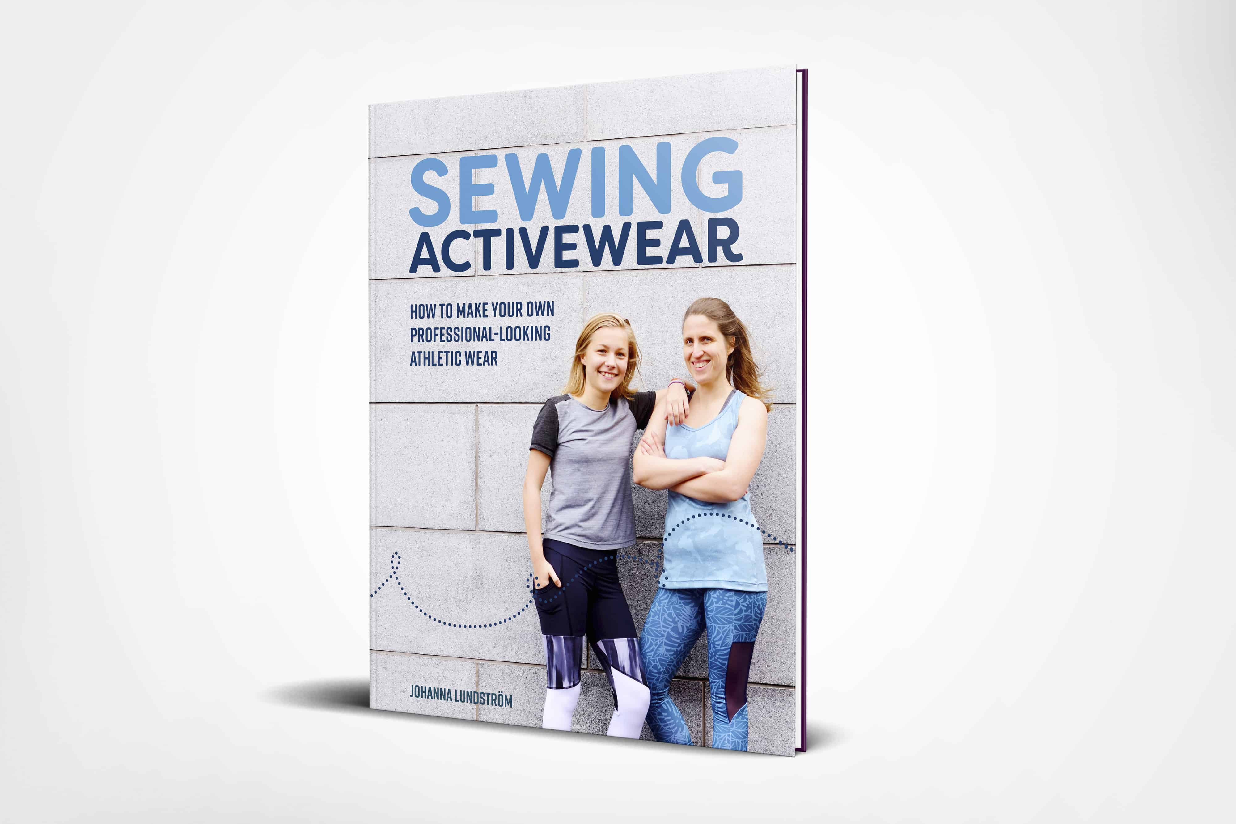
I also tweaked the typography, colours and the look on cover nr 1 after some great suggestions from you guys.
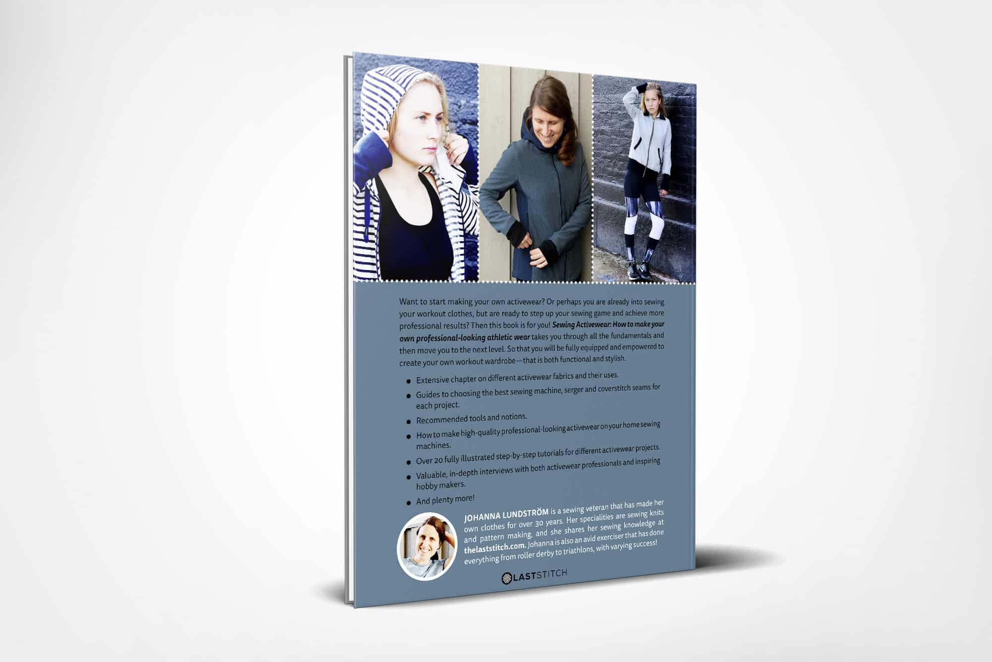
And the back cover (I might need to make the blue on the back a tad bit lighter for the black text to show.)
My reasoning for the choice is this:
As several of you pointed out, the small thumbnail view for cover nr 2 can be problematic. This was something I didn’t even consider when I first designed the covers, but the thumbnails on Amazon are often super tiny, especially on a cell phone. Which could explain why most craft/sewing books these days just have one big image.
However, you guys also made a very important point about diversity and said that this was nr 2 biggest strength and something you found appealing as a potential buyer. Luckily I got some great feedback about making nr 2 the back cover, and I went with that! Also, the book will get a website (so much to do, so little time!). And that gives me a place to use the diverse photo layout that you liked with nr 2. As for 1 vs 3, I picked cover nr. 1 since several of you mentioned that you liked the joy in the photo and that we didn’t look too “model-y”. And for me, joy and reliability are super important, so that signed the deal!
Again thank you so much for all the input. It can be a little daunting opening oneself up like this and ask for feedback, but I’m very glad I did ask you for help as it really boosted my thought process, and I think (and hope) that the final version is an improvement!
Now I need to start working on a website for the book that will also lists resources such as fabrics vendors and patterns. Upwards and onwards!
10 Comments
PsychicSewerKathleen
Such a lesson in asking people for feedback and how valuable it can be! Thank you for all you’ve shared in this process Johanna and congratulations on reaching this milestone in your sewing journey. Can’t wait to have my very own copy 🙂
Johanna
Yes indeed! Getting input is super important when writing this kind of book and I’ve been very mindful of not creating the content in a bubble – I want to make a book resonates with the intended audience! And the book cover feedback was a great example of how valuable it is, I would not have been able to come to this cover decision without the feedback I got.
Faye Lewis
Great job J\Johanna, very professional!
Johanna
Thank you Faye!
Lorna
Looks amazing, great combination of all the positive feedback. Looking forward to reading the final book.
Johanna
Thank you! All the feedback really set my creative process in motion and it showed me a new way of thinking about the design, that I would never have gotten to on my own!
Summerflies
Congratulations on making a decision.. something I find difficult sometimes. I think it’s great you asked for opinions as sometimes others can see things more clearly or offer something not obvious to you. Can I say I liked the red “sewing” on the front cover better..either way I’m buying it when it comes out!
Johanna
Thank you! I totally see where you come from with the red, I really like it too. But to get a more cohesive look both back and front I went with the blue ☺
Adrianne
Congrats Johanna! I voted for cover 2, but now that I see your revised version I definitely like it better!! Your sewing tips are the best, so I am looking forward to purchasing your book!
Johanna
Thank you! That makes me super happy to hear that you like it, even though you voted for nr 2. I was a bit nervous going for the less popular version, but still making it more like nr 2
Comments are closed.