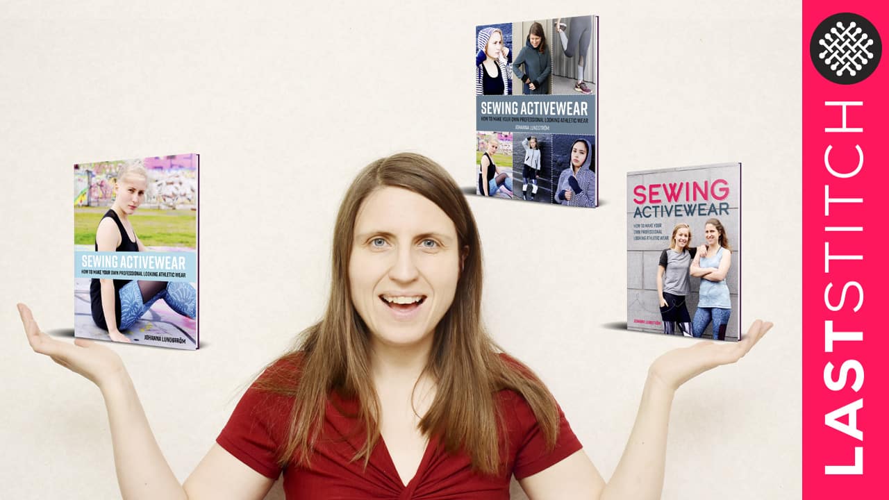
In December my first sewing book will be published (unless something unforeseen happens). Yay for that! But there are still several things remaining before I can press publish, such as deciding on the book cover. So I figured I should reach out to you guys and ask for your input. I’ve done three different versions and what I would like to know is which one you prefer? And if you could give a motivation and perhaps suggestions on how to tweak them, even better! Please tell me in the comment section!

Option 1.

Option 2.

Option 3.
Also, I want to emphasise that I’m aware that the diversity could be better on the covers. That said, when it comes to the actual content, images and the people that are featured in the book I have definitely strived for diversity, even though I feel one could always do better. But I try to be mindful of it! And if you want to know who the models are, they are my daughters Stella and Anja and a friend of Stella named Sara. So the cover photo shoot was something of a family affair!
Now tell me, which cover do you as a potential customer find the most appealing and why?
52 Comments
Esther Mozo
I like the first because you’re there and both you and the other girl are smiling. I also like the third because the girl is pretty. The second cover is good because it shows all the variety of activewear that you will teach, but it’s not as good as the first and third covers because most of the people on it are not smiling. Maybe the best is the first. Good luck Johanna!
Johanna
Thank you for the feedback! You are right, the photos on 2 look a bit serious. If I pick nr 2 I will need to switch some of the pics, the feedback I’ve gotten has made me realise this. The 1 and 3 are industry standards today and will look okay even as a tiny thumbnail, which is another thing to consider!
Ann
Hi! They’re all nice, but I like option 2 the best. The colors and the font look the most modern to me somehow, and I like that I can see six different examples of what’s in the book. I also really like that in a couple of photos you can really see clothing details like pockets and zippers, so I can tell there will be some detailed instructions inside and that I can learn some new techniques. I cannot wait to buy a copy!!
Johanna
Thank you for the input, yes the diversity feels best with that cover! The others are more about one eye-catching photo, which has it’s pros and cons
Sus
The second cover for the variety. It communicates to the reader that there are many techniques they’re going to learn in the book. 🙂
Jenny
I vote for option 2. It looks more like a sewing book to me – shows good details so I know what I’d be getting. This is the one I’d pick off the shelf if looking for a sewing book.
Kathy
I think all the covers are nice. I wouldn’t buy or not buy the book because of one of the covers or another. As a mother, I would use number 2 because I wouldn’t want to feature only one of my daughters on the cover as in numbers 1 and 3. Could you do a cover with both girls or both girls and you? I also like number 2 because I get the idea that there are lots of different types of garments in there.
Susan A.
I prefer number 1. I like that there are two models of, shall we say, varying ages. I think number 2 is too cluttered. Number 3 displays only one outfit, and the banner across it obscures too much of the outfit.
Tracy Maurstad
Option 2 is the one that immediately caught my eye. You get a sense of the options and detailed touches that will be in the book. And I like the “stitches” between the photos, nice touch. I also like the title being right in the middle. But they all look very professional.
Kendra
Option 2 all the way. It gives a way better sense of what the book is actually about, and better showcases the clothes, instead of the people.
Jane
I prefer option 2. Looks good and gives a nice preview for f what’s inside.
Julia
Option 2 shows what you get inside the book …. That’s why I think you should go with that one!
Ann
I am also for option 2.
G
Option 2 is the most “active”, so the most à propos for activewer.
Johanna
Thank you guys for all the helpful input, I love to get your feedback, keep ’em coming 🙂 I’m a little partial to cover nr 1, because it is the design style that is the most common right now on diy/craft/non-fiction books, at least here in Sweden. But I agree it lacks variety and might be a bit flat?
Shaneka
I like the second one. It shows more options on activewear
Shelby R Seaman
I vote option 2, it gives more of an idea of what will be in the book, variety, while the other 2 don’t give much
Christopher Hansson
I vote for cover number 2 because the other two feels a bit magazine-y and number 2 also have the diversity that others mention abive too
Johanna
Agree nr 2 is the only one with good diversity. The only drawback I think is that in thumbnail format on Amazon it might look tiny and busy, which I didn’t realise until I did some research yesterday! So many things to consider!
M-C
Option 1,because there are 2 of you and you look like you are having fun. Option 2 is also good because it shows a lot of the designs, but it’s busier (which isn’t good for online thumbnails) and it really needs more diversity then. And I don’t like option 3 which just looks like generic pretty girl exercise advertising
Johanna
You bring up a great point about the thumbnail thing, that issue only dawned on me yesterday when I was doing some research. That could explain why multi-photo layouts are on the outs. So many things to consider!
Sharon
I like the layout of 2 but the text colour of 1 –
Number 3 doesn’t appeal as it gives me no clues as to what the book would offer me.
Cynthia
I like cover #1. It feels more “modern” and less “busy” then #2. The girl on cover #3 is beautiful–distractingly so.
Margaret Baylis
I like #2 for a variety of reasons. As an older not so slim woman I would probably dismiss the other 2 as ‘not for me’. I also like the fact that the white print of title on dark blue really stands out. In number 1 the title words in different colours put the emphasis on the red word and the blue word gets lost. Well done on getting this far – what an adventure for you with SO much hard work.
Diedra Deutsch
I like option #1 because both of the models are “real” people, flaws and all. The only change I would make to the cover is perhaps a more colorful tee on one of the models. It’s all a bit grey and blue. I would pick that book up in a instant because I would want to open the book and see what other kinds of projects are included. #2 gives me an impression of more of the projects and I might give the book a pass and not look farther just because I will think that’s all that’s included. It’s also just too cluttered. It’s not logical, but it’s my first impression. #3 – It just doesn’t interest me and I don’t know why. Perhaps the beautiful girl is just over the top athletic and I would think the active wear in the book just wouldn’t be for me. Perhaps it is because the overall impression of that cover is very pastel in color choices. I would go for #1 because it would entice me to open the book and look further. I didn’t spend a lot of time over-thinking but glanced briefly at all three covers and “pretended” in my mind they were different books in a shop. I’d have picked up #1 for a further look and looked past the other two.
A
Option 2! It’s enticing, and shows what’s on offer. 1 and 2 simply show attractive people, just like every other book and magazine out there. Two showcases what’s special about YOUR book! Two tells me that there are a variety of garments inside, which suggests I’ll find something (or several things) I’ll like. One and 3 just don’t call out the garments; they just sell an ordinary view of a lifestyle.
Denise
Option 2 indicates what you are buying the book for. Option 1 gives a picture of yourself, the author and several pieces of clothing – presumably included in the book. Option 3 is a beautiful picture and would be lovely on your wall or inside the book, but I think you are selling sewing and not beauty. In my mind Option 3 feeds into the idea that fashion is for beautiful people and I think that sewing is for everyone. I realise that this is a personal interpretation. However, if you want a cover with just one person on it, I think that you are your own sales icon.
Heather Thompson
Leaning to towards the first one, the middle one is too busy,and the last one is good too… definitely 1
Chloe
Number 1 is the most inviting to me. Number 2 is too busy, it’s what I would look for in the introduction or table of contents. The smiles in #1 make me think that sewing activewear could actually be fun! Best of luck with the final stages!
Esther
I would choose version 2, it is more dynamic in my opinion. But option 1 gives also a feeling of safety, of knowing who the writer is, if I can express myself well…
Laurinda
I like the second one, because it shows the variety of clothes, & maybe if I start with the easy pieces, I can move up to the more difficult ones
Ana
I really like option number 2 as well.
Peg
I like option 2 because it gives me the best insight into the book’s content and has both younger and older women featured. Option 1 is my next choice because it looks family friendly – as though this book is going to have contents for REAL people, not models. Option three is a beautiful photo of your beautiful daughter, but doesn’t help me to know about the book. Also, it’s a bit too “cheesecake” for my taste.
Hope this helps.
Suzanne
Option 2. I like seeing a cover that gives me a good survey of what’s inside.
Marishka
I like #2 because the horizontal lines look more modern, thought out, and professional to me. #3 is also horizontal in orientation, but the advancing pastels hurt my eyes. The subtle blue tone of #2 made my eye linger longer and look at details. I also agree it communicates more of what to expect inside. #1 is very casual and I would more likely pass it by.
Mary
I think that no. 2 is the best. It shows more of what the book is about if that makes sense. I’m very excited for you to be publishing this book. Best luck for the book, I know you have worked really hard on this. Can’t wait to read it!
Mary in Thailand
I like option 2 shows a wider variety of the projects within the book.
Faye Lewis
Option #2 is more appealing to me; I like that it shows variety.
dawn
I like #2 because it shows a variety of finishing/garments/techniques that you might see inside the book. They are all nice, though.
Mary Nanna
I definitely prefer number 1 – it’s simple and the background is clean – number 2 is too busy for my taste and while the model on number 3 looks very attractive the background is distracting.
KathleenS
I like number 2 because it shows a greater variety of garments, which for me implies that the book will show me how to make all of those.
ana5059
I like option 2 because shows better what you can find inside.
Congratulations for your great job!
Summerflies
No 1 got my attention straight away. I like that it has you and your daughter on it (although I’d like one with both daughters too as someone else mentioned). I think it is the most bold and I like the banner on the top… straight to the point and such friendly, warm compelling smiles. No 2 is too busy but does show lots of options (for the back cover maybe). I don’t like No 3 at all… could be an exercise book. I agree maybe too much blue/grey with the grey wall but really it’s a great cover. Looking SO good though.
Irene Baskouta
I like the 2nd option because of the variety of garments that are presented.
Adrianne
I like them all (the photography is very professional!), but my favorite is number 2. I am excited for the release!
lauraborealis
Option 2. The others read as dated to me.
Samantha
The second one is the one I would be most tempted to buy. There are several examples of what’s in the book and it makes me feel like I’m getting an abundance of patterns and styles. Having said that all the photos are excellent and your girls makes great models!
Chris Griffin
The first one! It shows well when teeny on my phone. It’s happy. You two are wearing different clothes, so it shows the diversity of the pattern book. Wins all around.
Two is a tad too cluttered.
One doesn’t show sufficient work.
Beata
I like option 3 – I love the colors and the mood of the shot, it’s so pretty and professional looking!!
Karen
All 3 options are nice but I like option #2 the best. The cover gives you an idea what’s included in the book.
Baiba
I would say option 2 but I would try to add some pictures with you and sewing machine in between some of the existing ones. Excited to see the result 🙂
Baiba
O, I see you picked your cover already … I really like the end result, good idea combining both together (cover and the back).
Comments are closed.